LLM Gateway USERS & GROUPS
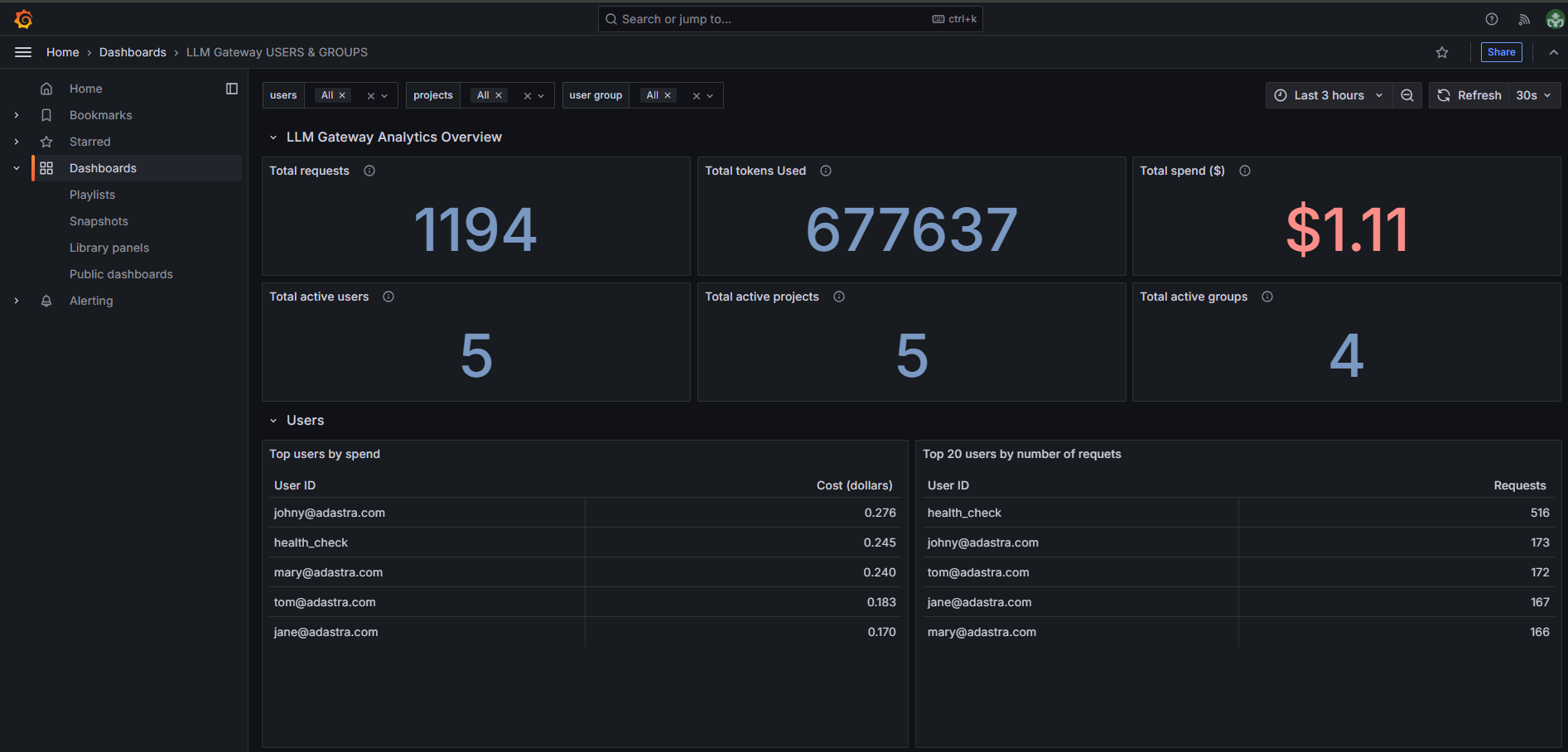
The Users & Groups Analytics dashboard provides comprehensive insights into user activity, project usage, and group-based metrics across your LLM Gateway deployment.
Dashboard Overview
Overview Metrics
The dashboard displays six key metrics tiles providing a high-level summary:
-
Total requests - Shows the total number of API requests made across all selected users, groups and projects,
-
Total tokens used - Displays the aggregate token consumption across all selected users, groups and projects,
-
Total spend ($) - Shows the cumulative cost in dollars for all selected users, groups and projects,
-
Total active users - Number of unique users who have made requests in the selected time period and filter,
-
Total active projects - Count of projects that have generated activity for the selected filter,
-
Total active groups - Number of user groups with active usage for a selected filter.
Users Section
The Users section provides comprehensive analytics across multiple views and visualizations:
User Tables
-
Top users by spend - Lists users ranked by their total cost contribution,
-
Top 20 users by number of requests - Displays the most active users by request volume,
-
Users overview - Provides a detailed breakdown of all users.
User Visualizations
Top 10 users by spend ($) - Horizontal bar chart showing spending distribution among top users,
Top 10 users by number of requests - Horizontal bar chart displaying number of requests by user,
User spend per request ($) - Time series line chart tracking cost per request over time,
Tokens per user - Time series line chart showing token consumption patterns over time.
User Groups Section
The User Groups section provides detailed analytics for organizational groups and departments:
Group Tables
-
Spend per user group ($) - Horizontal bar chart showing total spending by each user group,
-
Number of requests per user group - Horizontal bar chart displaying number of requests by group.
Group Visualizations
-
User group spend per request ($) - Time series line chart tracking cost efficiency over time for each group,
-
Tokens per user group - Time series line chart showing token consumption by group over time.
Filtering Options
The dashboard provides three powerful filtering mechanisms to analyze usage patterns at different organizational levels:
Users Filter
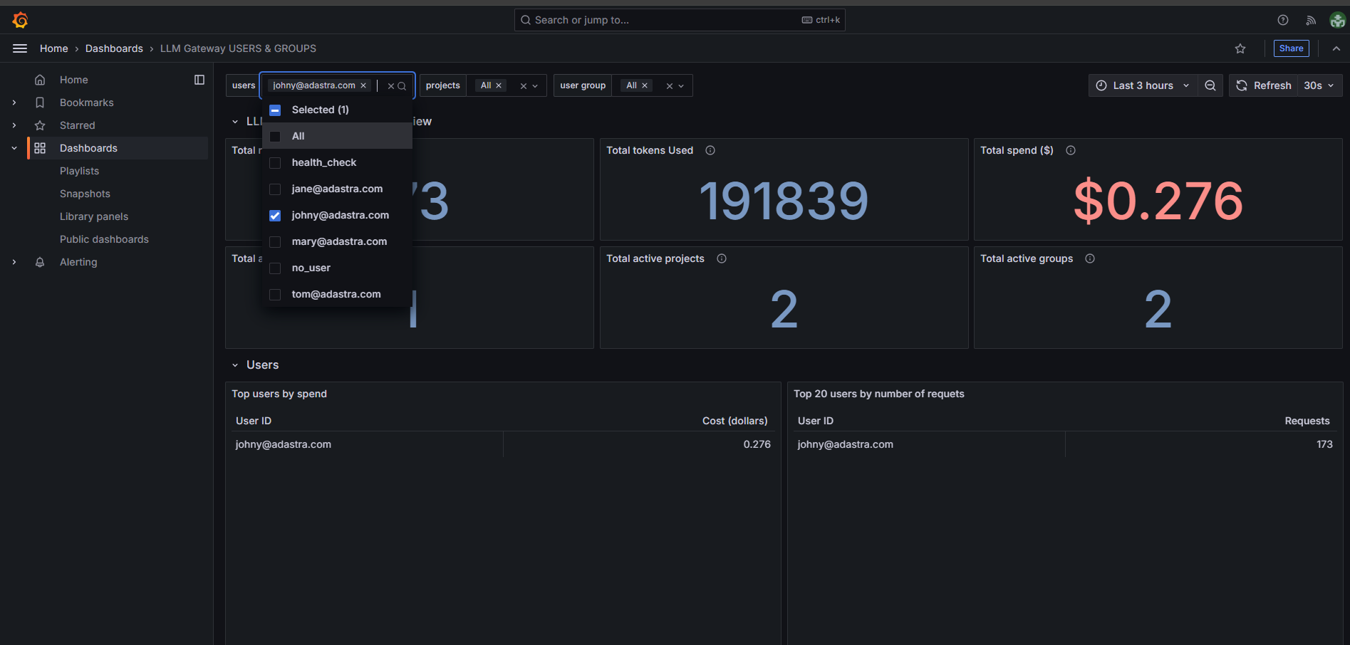
- Select specific individual users to focus analysis on their activity,
- Filters all dashboard metrics to show data only for chosen users.
Projects Filter
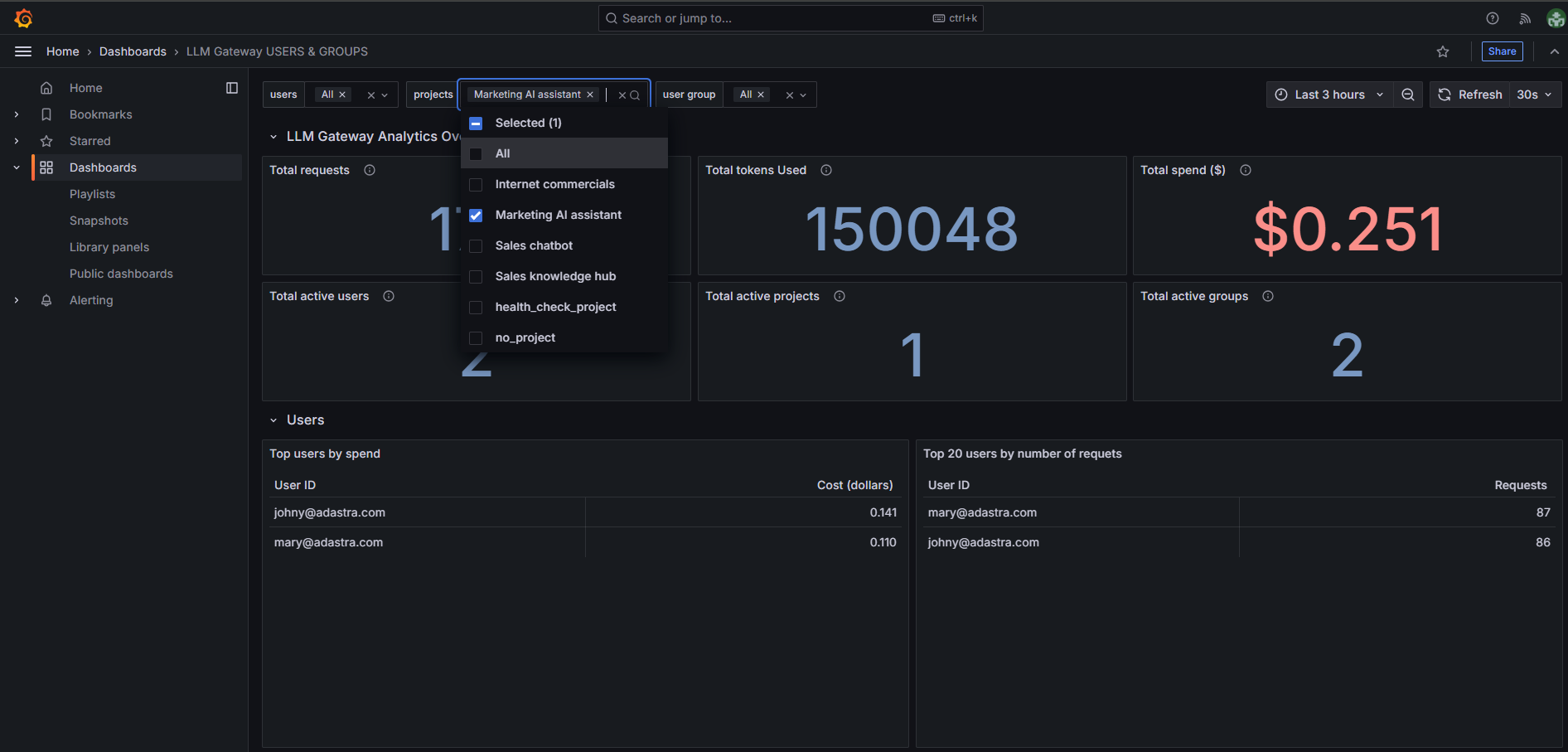
- Filter by specific projects to analyze project-based usage patterns,
- Shows metrics for selected projects only.
User Group Filter
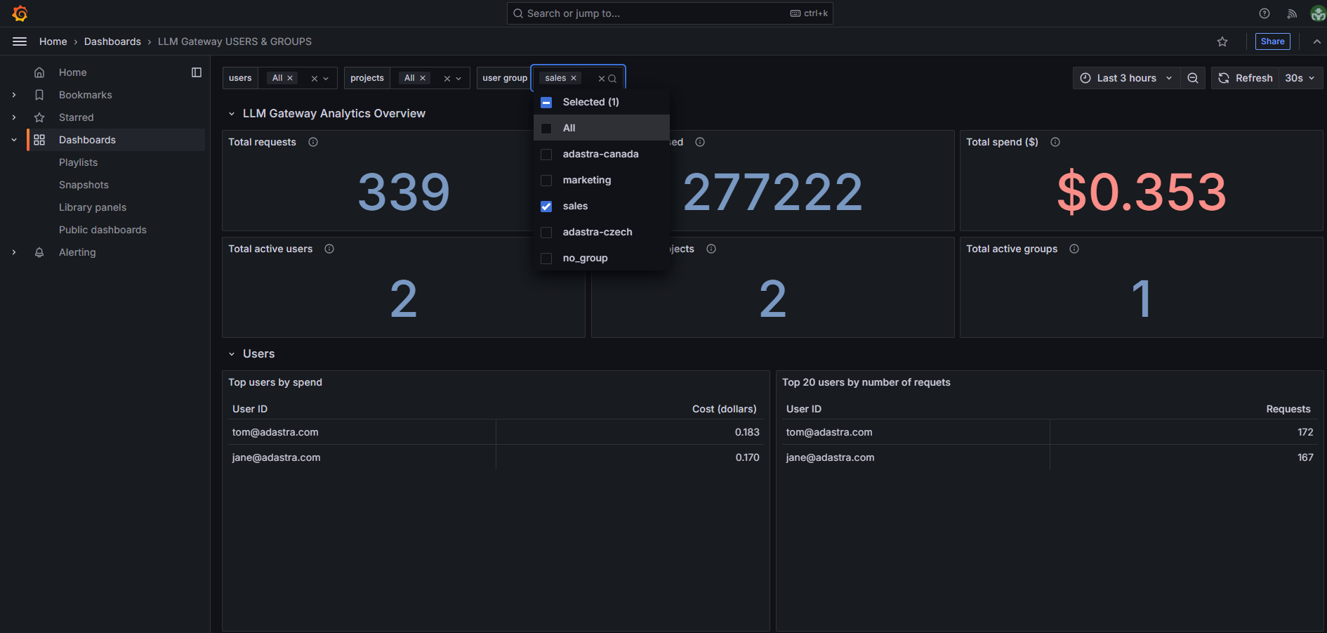
- Filter by organizational groups to analyze team-based usage,
- Provides insights into departmental or regional usage patterns.
Note: When applying multiple filters simultaneously, ensure they are compatible. For example, if you select a user who isn’t part of a selected group, you may see no data in the dashboard.